

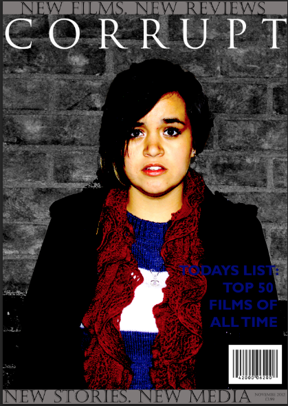


This is the first draft for the magazine front cover. Sophina made this and as you can see from the use of red, white and blue, it is obviously a British magazine. However, she has kept to the horror genre and has used dark shades of grey to accentuate the fact that the main article is about a horror film. She has used the same font for the magazine title that we used in the trailer, which links the two together. Before I took this photo for the magazine cover, we asked Lein to dress in red, white and blue if possible, and this is what she chose. The style is informal and familiar to our audience as it is casual and everyday-wear. There are a few things that can be improved with this front cover; The date is missing a letter (bottom right), the title of the magazine is the same as our production name - we should of thought up a name for the magazine separately as this could lose us marks- and finally, the name of the movie -'Hunt'- is in small writing at the top left of the cover and cannot be seen easily or clearly. The viewer will not see that the main image is linked with the first article mentioned -'HUNT / THE NEW HORROR SENSATION'- and this therefore isn't clear as to what the image is about.
 RSS Feed