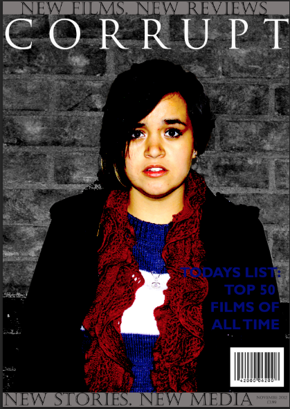
This is the first draft for the magazine front cover. Sophina made this and as you can see from the use of red, white and blue, it is obviously a British magazine. However, she has kept to the horror genre and has used dark shades of grey to accentuate the fact that the main article is about a horror film. She has used the same font for the magazine title that we used in the trailer, which links the two together. Before I took this photo for the magazine cover, we asked Lein to dress in red, white and blue if possible, and this is what she chose. The style is informal and familiar to our audience as it is casual and everyday-wear. There are a few things that can be improved with this front cover; The date is missing a letter (bottom right), the title of the magazine is the same as our production name - we should of thought up a name for the magazine separately as this could lose us marks- and finally, the name of the movie -'Hunt'- is in small writing at the top left of the cover and cannot be seen easily or clearly. The viewer will not see that the main image is linked with the first article mentioned -'HUNT / THE NEW HORROR SENSATION'- and this therefore isn't clear as to what the image is about.
This is the first draft of our film poster. As you can see from the stages, I started with the original image of Lein and then progressed to make several layers which would make up the finished image. I decided to incorporate a side-view image of Richard to show that Lein was surrounded by a stalker -Richard- and used two Richard's to achieve this. I changed the opacity of both copies of Richard to make it seem as though he was invisible, but in reality was just making himself invisible to her.
I decided to make the 'COMING SOON' and the date of release quite big, to attract the viewers attention and to accentuate the release of the trailer to make the audience remember it. For the review at the top of the poster, I decided to use 'Massacre' as the name of a magazine as it has connotations of horror and bloodshed, which reminds the viewer of the typical horror genre. 'The Shining' was the best horror of it's generation, with a strong psychological aspect which can be linked with our trailer. The fact that the quote states that 'Hunt' is "the best horror since 'The Shining'" tells the viewer that the movie is another classic. For the logo for 'Hunt', I used an online text generator - http://www.interactimage.com - and then used Photoshop to select only the words and the spatters of white around the letters. If i didn't do this, the black background of the logo would have brought a solid rectangle of black infront of the picture and this would have looked both unprofessional and would have ruined the overall look of the poster. We all decided to make our target audience both boys and girls of 15 and over. We chose this particular age because we thought our trailer/film would be too disturbing for ages 13 and under. This is the new and final edit of the poster. As you can see, I have included an extra line of text to make it clear to the viewer who has made the film. I have written it in a way that makes it seem as though we have made films before and they have been successful and popular - the use of 'from' makes us sound as though we are a big production company and should be recognised. I have used the same writing that was used in the trailer and on the rest of the poster, but have stretched it out so that it appeared dominant and can be noticed and read easily, but is small enough to make the title of the movie stand out the most.
I also added our Corrupt productions logo to the poster, to show that we made it and that Corrupt Productions is 'real'. Lauren designed the logo on the same website that I made the 'HUNT' logo on - - and we all agreed on this font and colour because it reflects the horror genre and hasn't been used by the other groups. The writing looks as though someone has etched it and it reminds me of the famous 'REDRUM' writing from The Shining.
Today, I made the 'Hunt' logo that will be included in our trailer and on our ancillary tasks - a magazine front cover and poster. I tried finding a good font on Photoshop but couldn't find one that suited the horror genre or our trailer idea, so I searched online for a font generator and decided to use http://www.interactimage.com, which gave me plenty of options. In the end, I decided on this particular font because it is rough, and looks as though blood has been spattered and dripped - almost as though the letters have been written in blood. However, I decided not to make the letters red as I thought it would make the writing look tacky - I did try making the letters red, but none of the shades looked right so I decided to just stick with white. For the poster, I will select only the letters and the splatters of white around the letters because the black background and the rectangular shape of the logo will not fit right or look right on the poster.
Today, we all worked hard in the double media lesson to complete our trailer ready for it to be marked by Ms Javaid and Ms Powling. I focused mainly on my blog, updating what we did in previous lessons. Lauren started making the Corrupt production logo to include in the trailer and the poster and Sophina made some finishing touches to the trailer. In these 2 hours, we got the trailer finished and the poster needs one more lesson to finish. We decided not to add any extra sounds to the trailer, as the heartbeat and the music gives enough atmosphere - any more sound would make the trailer cluttered and noisy. During break, before the double media lesson, Sophina broached the idea of using a montage towards the end of the trailer to add a more interesting element to the trailer than having just a few scenes running smoothly. The montage consists of very short cuts from our existing footage and some footage which was recorded on Sophina's phone. We think it makes the trailer look better and gives off more of a tense and exciting atmosphere.
Today we focused mainly on including text on screen and choosing sounds to add to the soundtrack that Sophina made. We have stuck to our storyboard where the text is concerned and have used some themed animated backgrounds in the text shots. We decided to use Times New Roman font with all the texts as it is a familiar font for most people, and it also has a classic element to it. This is good because the idea of a stalker is as classic as a sub-genre can get.
Where the sounds are concerned, we are waiting until the whole trailer is finished with the sound because the track is long enough to go through the whole of the trailer. If sound needs to be added in small places, we will decide on that and act on it when we finish.
Today, Sophina continued to edit the trailer. Me and Lauren both suggested the the camera should cut from Richard walking to Lein and the other two girls sitting down, then to a shot of the back of Richard as the girls ask him to take a picture of them. We zoomed out with this scene anyway, and we all thought that it looked as though we were the ones 'spying' on Richard and the girls, as is a main element of the trailer. We also decided to cut the sound from this scene, as it made the shot seem cluttered and annoying, and would probably result in a loss of concentration from our audience. We added in the other footage, and have started to organise the trailer into a decent layout.
 Today, I made the distributors logo which will be placed at the end of our trailer. I decided to use the name 'Flashback Distributors', as people associate the word 'flashback' with lightning, and a large population of people are scared of it. I got the main image from Google Images and managed to stretch it so that it took up the whole background, and I then cropped it so that the bottom of the image - a somewhat blurry city scape - was taken away as it made the overall image look cheap and dull. I decided to use this particular font as it is modern but is spaced out enough to be able to go from one side of the image to the other without being squashed or stretched.
When I pass the logo on to Sophina to include in the trailer, I would like to find a thunder-like sound to go with the logo when it comes up on the trailer, as it would relate to the flashback idea and also the image of the lightning.
the original image ^ THE FINISHED LOGO ^
On Saturday, Sophina started making a soundtrack for the trailer. She used a program on her own computer called Mixcraft. It sounds really good and we are planning to include it in the trailer as soon as we have all of our footage. After listening to the track for a while, I decided that it reminded me of horror films from the 80's and 90's because of the over-use of violins to accentuate a change in atmosphere or scene. The heartbeat, however, makes the trailer feel more modern because it is used quite often in modern films of many genres to show love or fear. The sharp, high piano notes at the beginning of the track would draw the viewers attention to the trailer, as people tend not to concentrate on a trailer if it has boring music, or no music at all.
Today we worked mainly on the Macs on our blogs and the start of the trailer. Lauren started looking for sounds online to use as effects in certain areas of the trailer and I started editing images from the 5th so that I can start making the poster which we've chosen as one of our ancillary tasks. Sophina started putting the footage onto her Mac and started experimenting with the different tools and the layout of Premier Pro so that she could work primarily on the trailer. As a group, we have decided that these would be our main roles, but we would each take turns editing the trailer and making suggestions as to what could be changed or manipulated.
Today, we started assembling all the pieces of filming that we had so far using Premiere Pro on the Macs in the Media room. We chose to use Sophina's desktop to store all the saved editing so far as there are computers either side which me and Lauren had saved images and sound onto. Sophina has so far learnt the most about using Premiere Pro, but I've been listening and watching and have picked up a few techniques and how to use certain tools such as the razor tool and the select tool.  The arrow is the select tool, which allows you to select a clip or a section of a clip and move it around or put an effect onto it.
The razor tool enables you to select a clip and split it into two separate clips. Using this tool, you can either crop/trim a clip, remove or separate parts of a clip.
|


 RSS Feed